Master en-suite in Epsom
Our clients’ master luxury en-suite bathroom was fitted with period style furniture which can be quite clunky in design. This made the master en-suite feel very small. Our couple were after a stylish and sleek look – which the boxing along the floor hiding the pipework, makes the floor space seem smaller and busy.
We reconfigured the layout, moving the toilet to the outer wall, freeing up space to create a wide shower area. The semi-frameless Matki shower screen keeps the area open, so you can see straight through the length of the room.
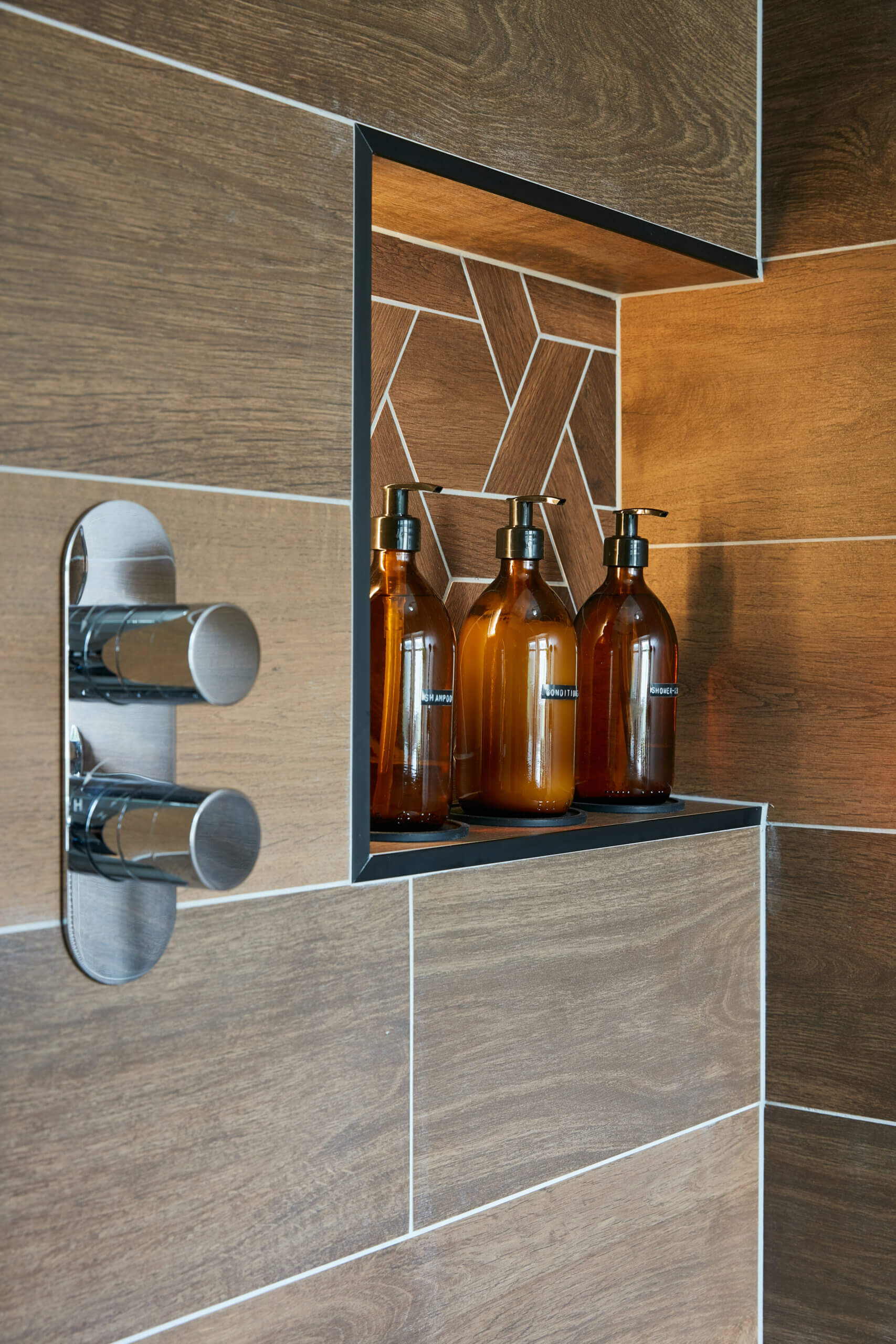
By using wall hung furniture, more of the floor is visible – creating the illusion of a more spacious room. Wood effect tiles are laid horizontally which makes the room seem wider. The moka tones in the tiles by Minoli balance out the black basin, flush plate, towel rail and corian worktop. Woven style wooden mosaic in the recess adds a focal point and adds interest to the design.
LED lighting in the recess and under the Dansani basin, creates low level lighting effect, perfect for night time trips to the master en-suite .
Category: En-suite
We built out a ledge half way up the wall, to house pipework to the basin and WC. Creating a ledge finished with a corian solid surface worktop. Uniting the black tones with the black basin unit and anthracite finish on the radiator.

We created a recessed shelf within the shower area for practical use, adding Moka mosaico tiles within the recess to bring a focal point to the design.

We moved the WC away from the end wall to create a spacious showering area, which makes the room feel wider. Also, by using furniture that is off the floor gives the illusion of a larger space.


